Introduction
Few Day's ago my friend wanted to explore Gujarat pinged me for must-visit places in Gujarat.
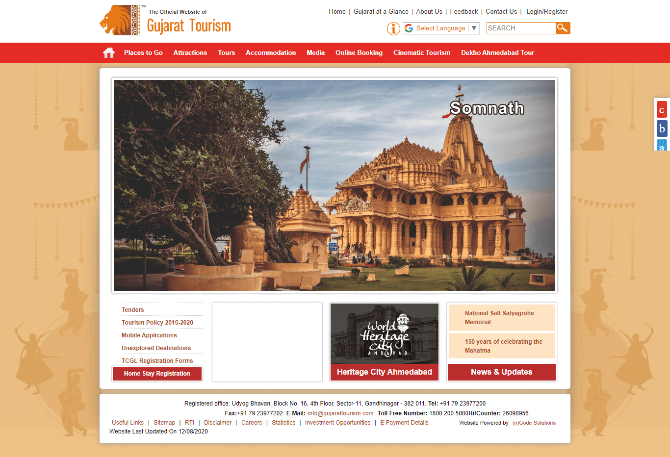
I wanted to help him so I decided to put an itinerary. So the first thing I did was to Google "Tourist places in Gujarat" and Gujarat Tourism's official website was on top.
I went on the website and I confused by the overall experience. The site had very little visual appeal and its presentation seemed a bit off.
So I decided to come up with a redesign of Gujarat Tourism official website.
My Roles
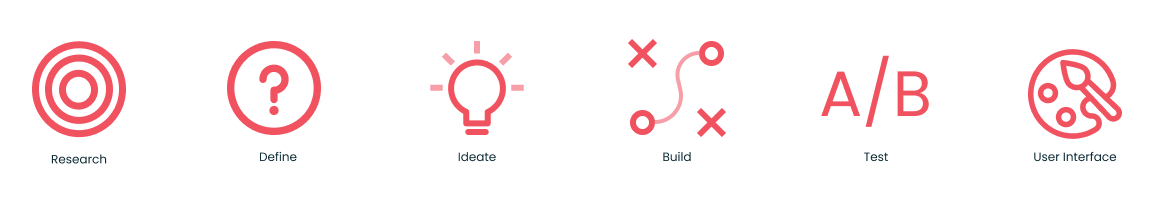
My Process
1. Research
Characterising the problem, Understanding the why? What we're trying to do and What is the thing we're trying to solve.
I carried out Research in three stages
First, I wanted to know a user's thoughts on exsisting website.Their likes and dislikes,what features do they use and general overall feeback.
Second, I wanted to know what other tourism website's are doing, how and why they've structured their websites and get a general idea.
Thrid, I conducted an online survey in which I asked questions regarding how and why people use a tourism website.
Based on this, I got an insight of the features, layout etc.

Usability Testing
I wanted to know what users thought about the existing website, what were their likes and dislikes. This gave me a rough idea of things that need to be redesigned or just need a small "fix"
Likes
Depth of Information :Users liked the amount of information presented on the website, information like how to get to a certain place,the history behind a certain festival or historical significance that helped them decided and plan their trip.
Depth of information also helped with SEO.
Dislikes
Navigation: The horizontal dropdown menu of the nav bar is annoying. Since it's height is small, users frequently moved out of dropdown menu which meant they had to go back to the main naivgation and repeat the entire process.
Unrelated Information:Website is filled with unwanted information like tender openings, w3c certifications etc which could be moved to other sub pages.The overall architecture isn't proper.
Visual Representation:Website had very little visual appeal to it.
Responsive:The website wasn't responsive to different screen sizes
Competitor Analysis
Second I wanted to know what's the main use of a tourism website, so I browsed through various tourism website, the ones that stood out for me were of Sweden, Japan and Iceland.
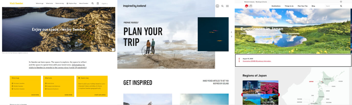
Sweden and Iceland went with minimalism, they didn't try to do too much. They did one thing that was providing people with information and did it insanely well. The website load time was quick, easy navigation and the layout provided enough breathing room.
Japan structured their website really well, it was easy to navigate through the website but I felt overwhelmed by information and the way it was presented
Key Learnings:
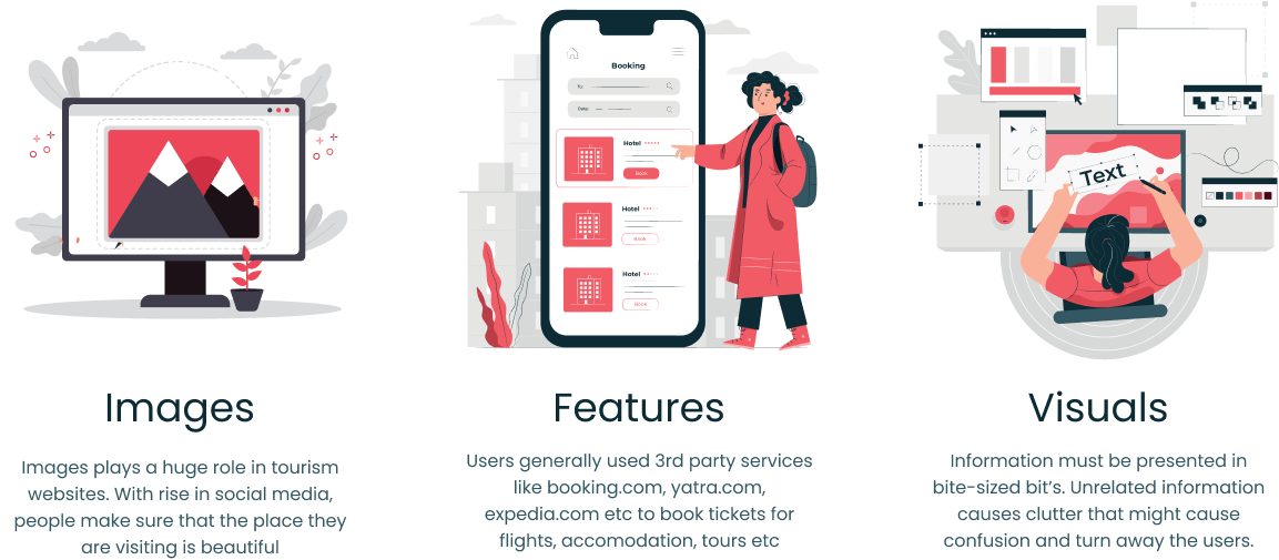
Images were the center of these websites, a user judges if they want to visit a place or not heavily dependent on the images.
Bite sized Information these were information heavy websites but the information was presented in a consumeable sizes with images to support it.
Features none of the websites had account creation or booking facilities, their main purpose was to provide information.
User Research
I wanted to know when a person visits a tourism website what are their expectations, how do they want the information to be presented, what features do they expect from the website.
Based on these fundamental questions, I created a survey that was completed by 17 people.
Survey Questions
-
1 What's your age?
-
2 How often do you travel?
-
3 Do you travel solo or with group of friends or family?
-
4 How do you collect information about a place you want to visit?
-
5 Do you visit an official tourism website of the place and if you do, why?
-
6 What information do you want on an official tourism website?
-
7 Which website do you use for booking tours and accomodation?
-
8 Do images and videos play a role in deciding a place you want to visit?
-
9 If yes then why ?
General Takeway
1 People who ferquently travel usually use third part booking websites like Booking.com, Yatra.com etc to book accomodation, travel tickets and tours.
2 People expect information regarding visa, sim, currency used, emergency helpline contacts etc to be present on an official tourism website.
3 People usually decide whether they want to visit a place based on many factors like location, weather conditions etc. One of the biggest driving factor for people between 20-35 age group to visit a place was Youtube or Instagarm.
4 Images and videos of a place they want to visit also plays a huge role in decision making.
5 People expect information regarding visa, sim, currency used etc to be present on an official tourism website.
Insights
User Interviews, Competitor Analysis and Usability Tests gave me an idea about the layout, what's expected from website and required features
2. Define
Seeing the problems from an end user's perspective and defining a concrete problem statement, along with different processes and an end goal.
Problem Statement
Gujarat Tourism design looks outdated compared to its competitors. With such tight competition in the industry, a visual overhaul is long overdue. I thus set out to reimagine the Gujarat Tourism website so it can attract tourists in the years to come.
Solution Statement
I set out to completely overhaul th Website's look and feel and created a unifying design system that merges usability guidelines and aesthetic appeal. These changes impacted every corner of Gujarat Tourism website, including key interactions.
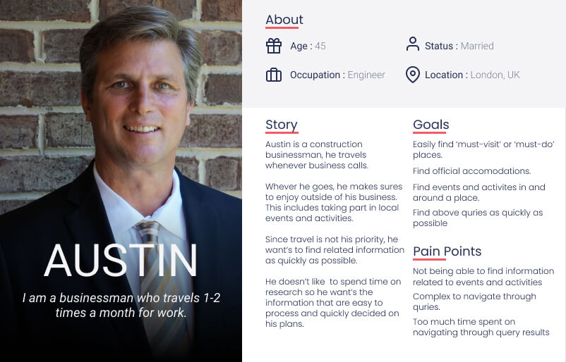
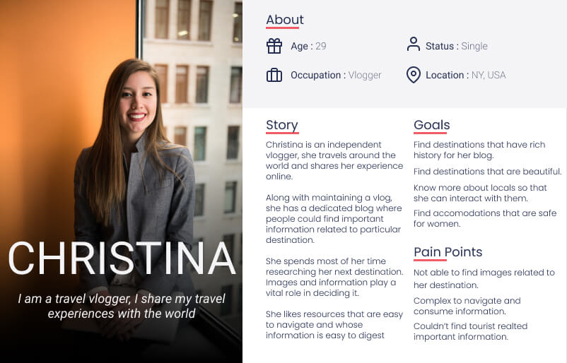
Personas
Based on user research, I created 2 personas. Meet Austin and Christina. The fictional personas were designed to guide me through the process while keeping the end user goals in mind.
3. Ideation
Analysing the research, thinking about possible user flows and information layout on the page.
In this phase I analyzed the research and based on it I though aobut possible user flow, features and how should I structure the website
Here I wanted to think outside just the design aspects and dived into thinking about how the entire website will be developed.
I thought about design optimizations, required features while maintaining a balance between information and images.

Design Thinking
Initially I was confused as of where to get started so I started out by asking and researching on a very basic questions.
Why do we need a landing page?
The Marketing aspect
I found out that the main purpose of a landing page was to serve as a marketing tool, in this case, it was selling "Why you should visit Gujarat"
It should provide enough information to the user while selling the idea of visiting that place.
So I decided to breakdown the layout into based on following question
What's the unique thing about Gujarat?
A Social proof from those who have visited Gujarat
What Gujarat has to offer to you?
And a conversion goal to booking hotels, tours etc.


How should I design the layout?
The Technical aspects
Since it is going to be an Image heavy website, I decided to go with a minimal layout that consists of few images and relevant text content.
I took inspiration from Instagram since it's an image heavy website.
Based on my understanding, I decided to go with a minimal design that was balanced between images and information
What features should it have?
Keeping it simple
During my research, I found that people preferred to book via third party booking websites like Yatra, Expedia, booking.com, etc
Also I saw that most of the existing tourism website didn't have any booking or login options.
This was because they already had offers that they wanted to use, so I decided to remove the sign in, sign up and decided to redirect the user whenever they wanted to book a tour or hotel, etc.

User Flow
Focusing on what the user needs to get done and how to deliver that in the most effective manner possible.
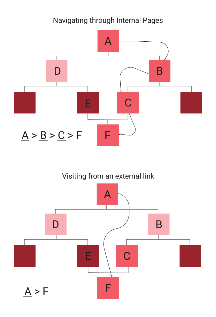
Based on research, there were three possible userflows
Exploring the website: The user want's to explore the website

Using the Advanced Search: When the user want's to search for specific information
Visiting from an external link: When the user is directed to website from an external link like blogs, SEO etc.

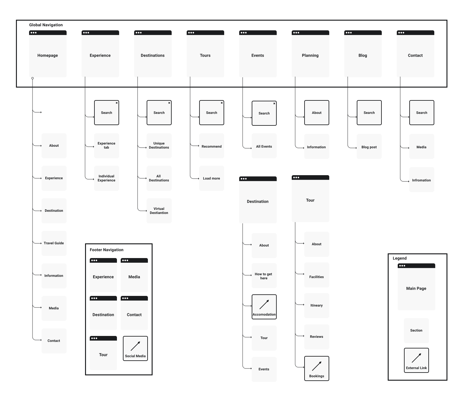
Information Architecture
After my thinking process, I mapped out an information architecture to visualize the hierarchy of different web pages and their contents.
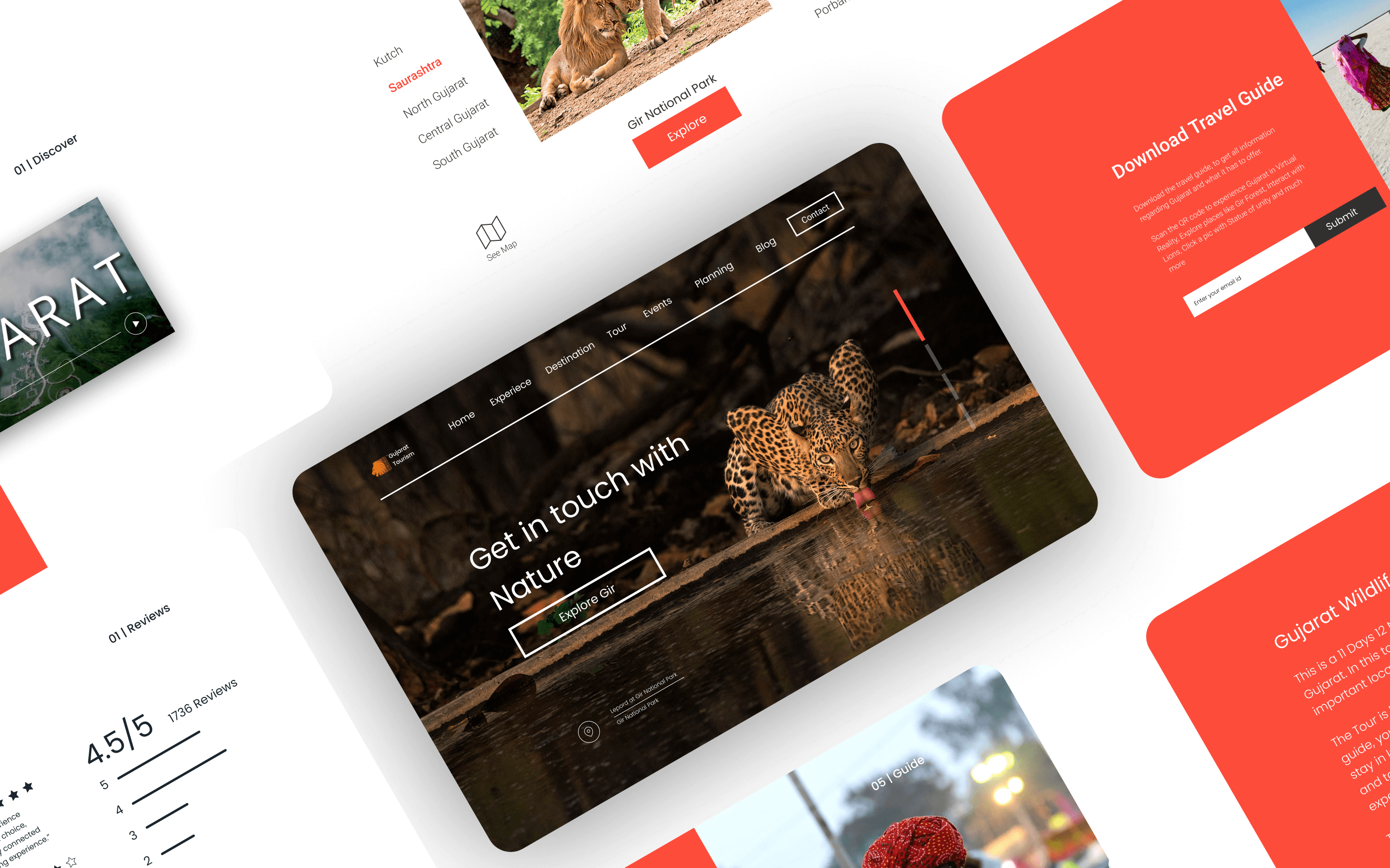
4. Wireframes
Converting idea to a concept, here based on the ideation process I thought about how the layout should look like. The placements of information and images such that the overall layout looks balanced and about various pages and their layouts.

5. Prototype
Converting concept to reality, based on wireframes, I create a clickable prototype. This served as a minimum viable product for testing. Prototyping went through two iterations.
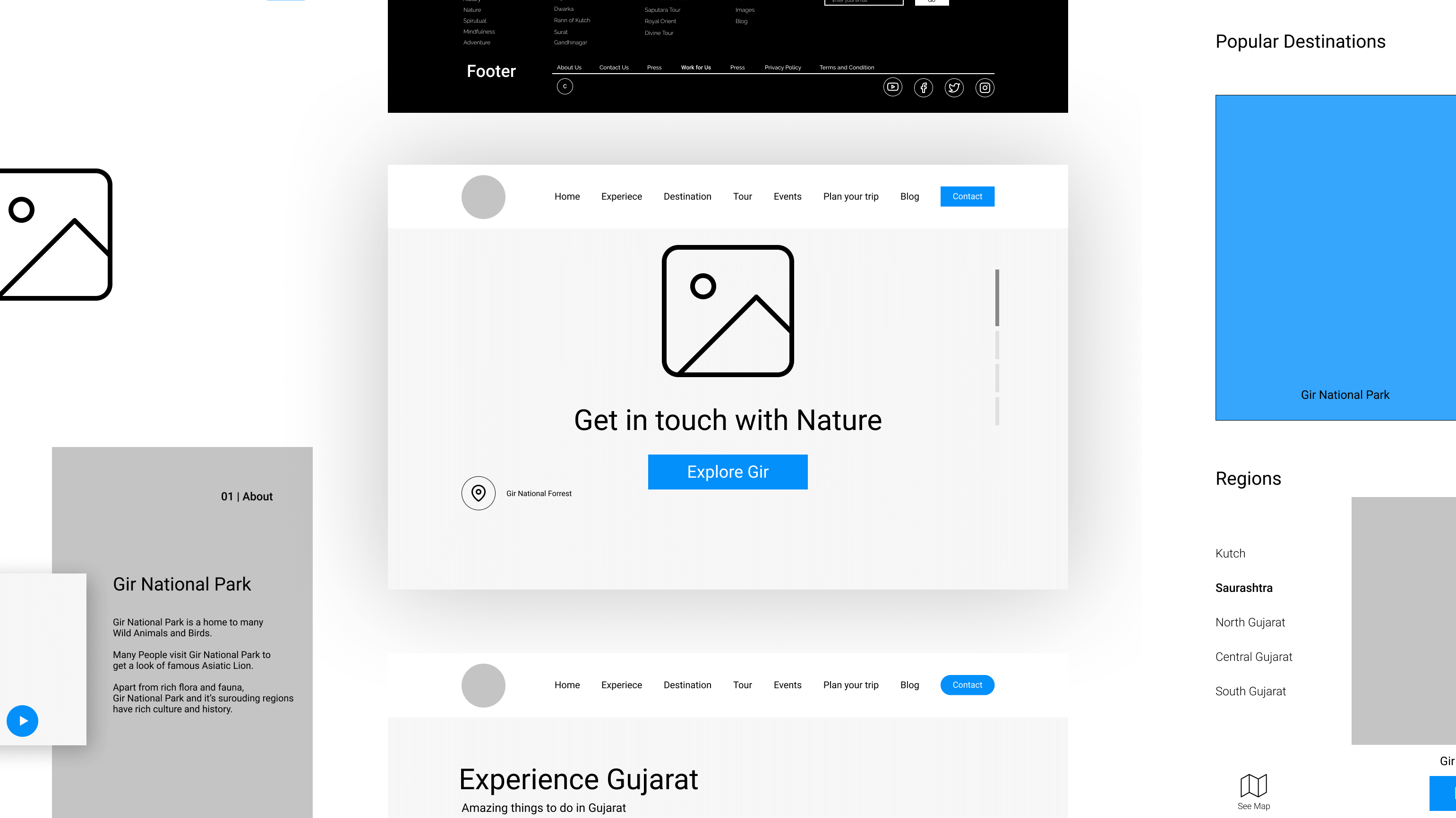
Play around with clickable prototype
Mid-Fidility Prototype5. Validate
Testing the ease of using the design on a group of users, understanding their pain points and interating the prototype
User Tests
Counducted user tests on clickable prototype
Aim was to observe how user completes certain tasks
Based on the feeback, interations to exsisting prototypes were made.
Tasks
1. Book a tour for your desired experience or destination.
2. Find helpline number
3. Find Visa information
4. User visited the website from an external link.

Breadcrumb problem
Solving a user navigation problem using breadcrumbs and research.
During my initial prototype, I didn't think of any practical use case of breadcrumbs but during user testing, I learnt that implementing breadcrumbs will help with easier navigation.
Since the website is polyhierarchical, it was difficult implementing breadcrumbs.
Eg:for booking a tour, there were three possible routes
Home page -> Tours page -> Tour page
Home page -> Experience page -> Adventure page -> Wildlife adventure page -> tour page
Home page -> Destinations page -> Destination page -> Tour page
Inspiration and analysis
I researched about breadcrumbs, pros and cons of using them and how to implement them
Dynamic Breadcrumbs: ie breadcrumbs based on user history, these are frowned upon since user might get confused.
External link: Another problem was, if the user visits an internal page from an external link, then how should the breadcrumbs look like?
Task Oriented Design ?
The main job as a developer is to design systems such that it's easier for the user to accomplish a task
In this case my task was to design a breadcrumb system such that it's easier for the user to navigate
This was my thinking when a user want's to book a tour at a destination of his choice
1. He could go to tours, and search for tours in the destination.
2. He could first go to the dsetination and then find the tours.
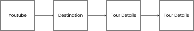
Since here the main task is to book a tour, following breadcrumb made more sense :
Homepage -> Tours Page -> Tour Details Page
Based on similar thinking I made a Canonical path for each page and designed breadcrumbs based on it.
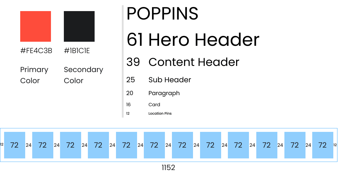
6. UI
After working the changes into the wireframes, it was time to proceed with the visual design. Since it was going to be responsive design, I chose the 8 point grid system. Colors were inspired by Gujarat's culture.


7. Lessons Learned
Marketing: This was the first time I dived into business aspects of a product, it was a new learning experience.
Image psychology: I learned about how Images impact the flow of the website, here my photography experience came to help. The psychology of how leading lines help in directing the eyes of the user from one section to another, how to use images to bring users attention to an important part of the website, how to edit images so that text over the image is more legible etc.
Breacrumbs: I learnt about how and why to use breadcrumbs, how to design them for effectively.
"If you are the only designer, you are not just a designer - you're you"- Ian Spalter.
This quote by Ian Spalter helped me thing outside of design aspects, it made me think with a business perspective, it made me think how this website will be built and how load time will affect the user experience and how an image will affect the psychology of user.
8. Next Steps
This redesign is far from perfect, I am already working on a simpler multilevel dropdown navigation so that user reaches their destination page as quickly as possible.